Published 17 July 2025 | Updated 18 July 2025
Web
Responsive Design vs Adaptive Design: Which One is Better?
In today’s digital-first world, where users interact with websites and apps across a wide range of devices, providing a seamless user experience is crucial. For businesses seeking modern web design services or working with top mobile app development companies, understanding the difference between responsive and adaptive design can influence how their digital products perform. Both approaches aim to optimize content across devices, but they differ in execution and flexibility.
What is Responsive Design?
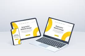
Responsive design uses a flexible layout that automatically adjusts to the screen size of any device. Whether your visitor is on a smartphone, tablet, laptop, or desktop, the website will fluidly adapt using CSS media queries and percentages.
Key Features:
- One single layout that scales fluidly
- Easier to maintain and update
- Recommended by Google for SEO
- Ideal for projects targeting a wide range of devices
Responsive design is the preferred choice for many businesses because of its cost-efficiency, scalability, and user-friendly nature. It simplifies the development process by requiring only one version of the website.
What is Adaptive Design?
Adaptive design, on the other hand, relies on multiple fixed layouts that are pre-designed for different screen widths. The server detects the device type and serves the appropriate layout. Typically, designers create 6 layouts for the most common screen sizes (320px, 480px, 760px, 960px, 1200px, and 1600px).
Key Features:
- Different layouts for specific devices
- More control over user experience on each device
- Faster loading on specific screen sizes due to targeted assets
- Requires more effort to maintain multiple versions
Adaptive design is often used when a company wants to tailor the experience for different devices, especially when catering to high-performance applications or unique UX demands.
Responsive vs Adaptive: Key Differences
| Feature | Responsive Design | Adaptive Design |
|---|---|---|
| Layout | Fluid, flexible grid | Fixed, device-specific layouts |
| Maintenance | Easier (single design) | More complex (multiple layouts) |
| SEO | Highly SEO-friendly | SEO-friendly, but more complex |
| Development Time | Generally faster | Takes more time |
| Customization | Limited per device | Highly customizable |
Which One Is Better?
The answer depends on your goals, budget, and audience. If you're a business looking for scalability, lower costs, and a streamlined process, responsive design is often the better choice. It’s easier to manage and aligns well with modern SEO practices.
However, if your product demands customized interfaces for different devices (like complex dashboards or e-commerce apps), adaptive design may provide superior performance and user engagement.
Conclusion
At PerfectionGeeks, one of the leading mobile app development companies and providers of premium web design services, we don’t take a one-size-fits-all approach. Instead, we analyze your project’s needs and recommend the most effective strategy—whether it’s responsive, adaptive, or a hybrid solution.

Written By Shrey Bhardwaj
Director & Founder
Shrey Bhardwaj is the Director & Founder of PerfectionGeeks Technologies, bringing extensive experience in software development and digital innovation. His expertise spans mobile app development, custom software solutions, UI/UX design, and emerging technologies such as Artificial Intelligence and Blockchain. Known for delivering scalable, secure, and high-performance digital products, Shrey helps startups and enterprises achieve sustainable growth. His strategic leadership and client-centric approach empower businesses to streamline operations, enhance user experience, and maximize long-term ROI through technology-driven solutions.